Empower colleagues to deliver care with clarity, confidence, and ease
CVS Pharmacy
Overview
CVS plays a vital role in healthcare delivery, serving millions of patients each week. However, its outdated and fragmented internal systems have become a major barrier to providing seamless, efficient care.
We helped reimagine how pharmacy colleagues work, from managing prescriptions to supporting real-time patient interactions. As one of the designers, my focus was simplifying complexity, improving visibility, and designing a future where technology supports care, not complicates it.
Role
Product designer
Team
5 Designers, Design Director
Timeline
7 months 2023-24
Disciplines
UX, Interaction Design, Service Design, Systems Thinking, AI & Automation Integration, Concept Development, Design Systems
Project goal
The tools CVS colleagues rely on were fragmented, outdated, and hard to master, draining time and energy from where it matters most. This vision project set out to show what’s possible: a streamlined, human-centred platform grounded in real pharmacy workflows, designed to unlock better service for patients and more meaningful work for colleagues.
Current impact
Conversations with stakeholders revealed that the current tools were failing the people who relied on them most.
Disjointed tools slowing
everything down
Colleagues juggle multiple outdated systems that don’t talk to each other, creating confusion and wasting time. It’s hard to master the tools, let alone work efficiently.
Colleague burnout
When systems work against people, not for them, morale suffers. High turnover, low confidence, and training bottlenecks make it harder for teams to succeed.
Patients feel the gaps
Incomplete visits, long phone calls, and repeated store trips have become the norm making medical care feel frustrating and fragmented.
Critical moments and
opportunities are missed
Colleagues don’t always have the time or visibility to surface helpful services like vaccinations or additional screenings. That means lost opportunities and sometimes overlooking real risk.
Research phase
To design something truly useful, we had to understand what stood in the way. We were lucky enough to have worked closely and collaboratively with expert CVS colleagues and stakeholders throughout the process.
Our senior designers visited U.S. headquarters to observe real workflows, explore existing tools and shadow colleagues as they navigated their day. I worked alongside them to translate these observations into actionable insights, from analysing recorded role plays to reviewing scripted pharmacist-patient calls and mapping where the system fell short in supporting real-life tasks.
Insights
What we found confirmed what colleagues already knew: the system wasn’t built for the reality of their work today and it’s becoming quite clear.
Outdated and fragmented systems
The existing tools weren’t built for today’s complexity. Over the years, layers of functionality had been added without integration leading to a disjointed experience. Colleagues now rely on four separate platforms, making it difficult to access the right information at the right time.
Opportunity
Design a unified experience that acts as a single source of truth, reducing friction, and bringing critical patient information into one accessible place.
Incomplete patient interactions & missed opportunities
Add-on services like vaccinations and screenings are often missed, not because they’re unnecessary, but because they’re buried. Without a clear view of a patient’s history or eligibility, colleagues struggle to identify or recommend what matters.
Opportunity
Give colleagues timely visibility into patient needs, and make it easy to take action. Helping them deliver more complete, more proactive care.
Manual workload and safety gaps
Much of the process relies on repetitive, manual input which leaves room for error and increases cognitive load. Colleagues often rely on memory, post-its, or workarounds to stay on top of routine tasks.
Opportunity
Use smart automation and safeguards to lighten the mental load, reduce errors, and build more confidence into critical touch points.
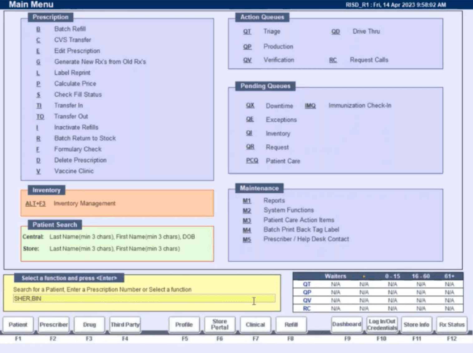
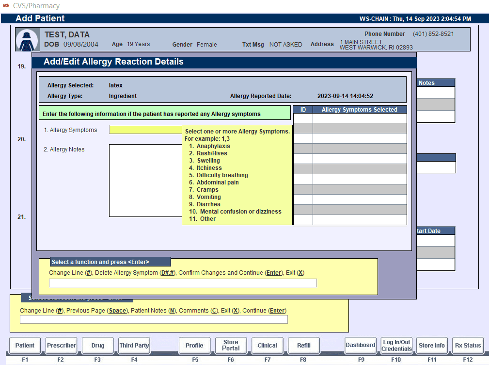
Current platforms
Constraints
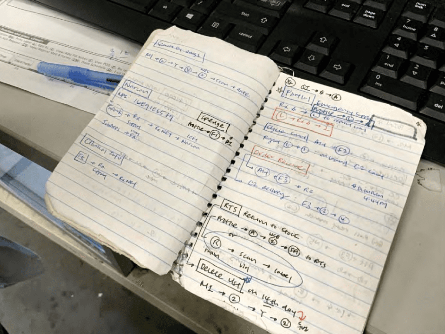
Keyboard-only navigation and N-keys
Most pharmacy workstations don’t use a mouse, so colleagues rely entirely on keyboard navigation using what they call "N-keys" a function bar at the bottom of the screen that accepts input shortcuts. Task flows aren’t easily discoverable, so many colleagues keep personal notebooks filled with N-key sequences. A clear sign of just how unintuitive and burdensome the current system is. Even highly experienced staff rarely feel they've fully mastered it.
This unique constraint shaped our approach significantly. Rather than overhauling a system colleagues had spent decades mastering, we leaned into it, rethinking workflows to feel intuitive through sequencing, clear visual cues. Designing without a mouse forced me to think systematically, creating interactions that felt logical, memorable, and less mentally taxing, especially for new users.
Limited influence over third-party systems
Certain tasks rely heavily on external providers such as handwritten prescriptions or rigid third-party data formats. Because these systems couldn’t be redesigned directly, we focused on reducing friction, clarifying context, and supporting accurate decision-making within those limitations.
Design challenge
“Our colleagues want to spend time on patient care, and we want to allow them the ability to do this.”
Approach
To create a vision that felt both ambitious and real, we structured our work around narrative-driven sprints each beginning with deep-dive stakeholder workshops with subject matter experts. These sessions uncovered real-life pain points and workarounds, shaping our direction and ensuring the designs stayed grounded in colleagues’ day-to-day experiences
My role focused on solving challenges that impacted multiple areas of the workflow—like unifying fragmented patient information, streamlining manual processes, and reducing errors in critical interactions. After each workshop, I mapped user journeys, sketched and prototyped solutions, and prioritised designs that directly addressed the most pressing needs.
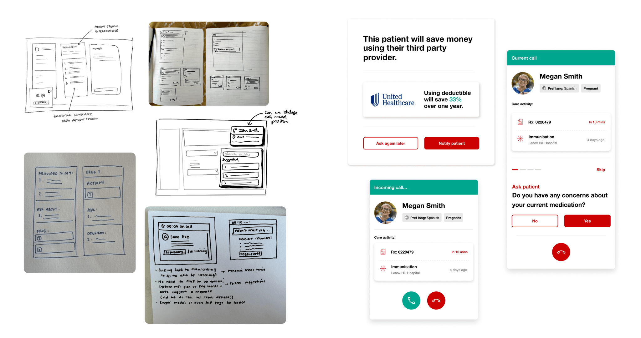
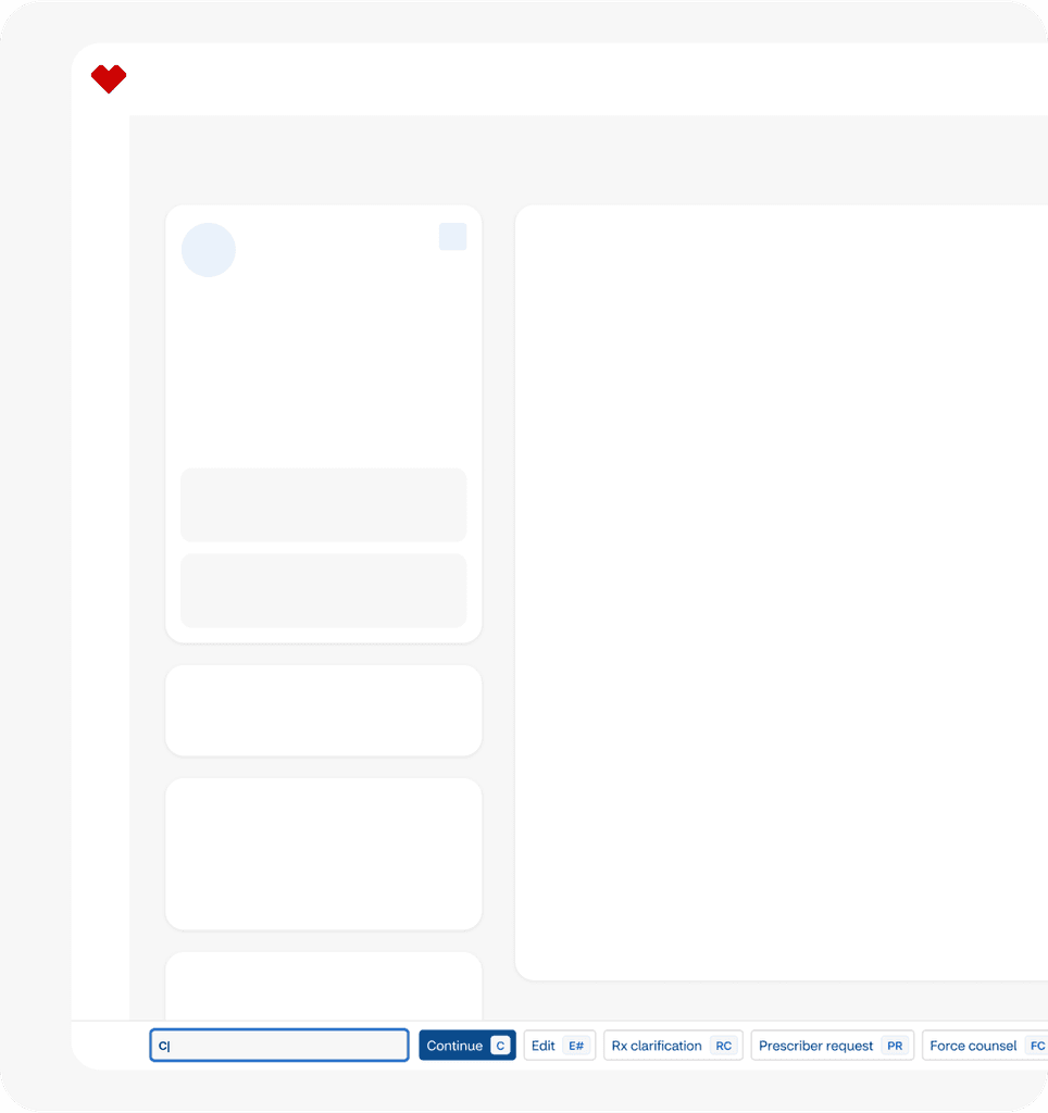
Initial sketches and wireframes for the guided call modal
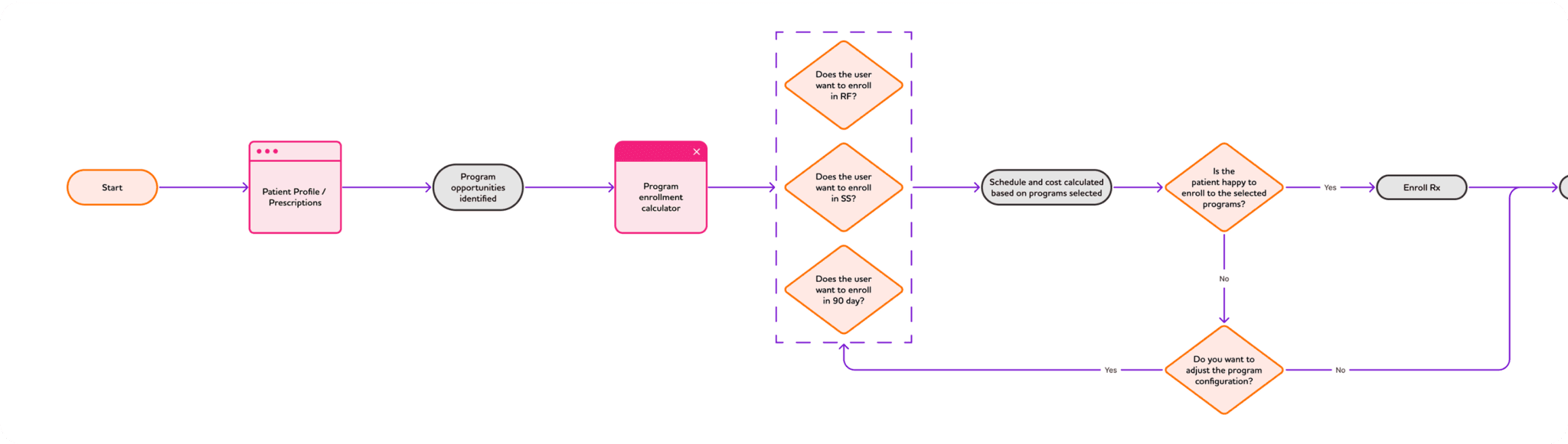
Proposed process flow for Program Enrolment
Solution and features
To tackle the most urgent issues facing colleagues and patients, I designed key features aimed at clarity, safety, and proactive care:
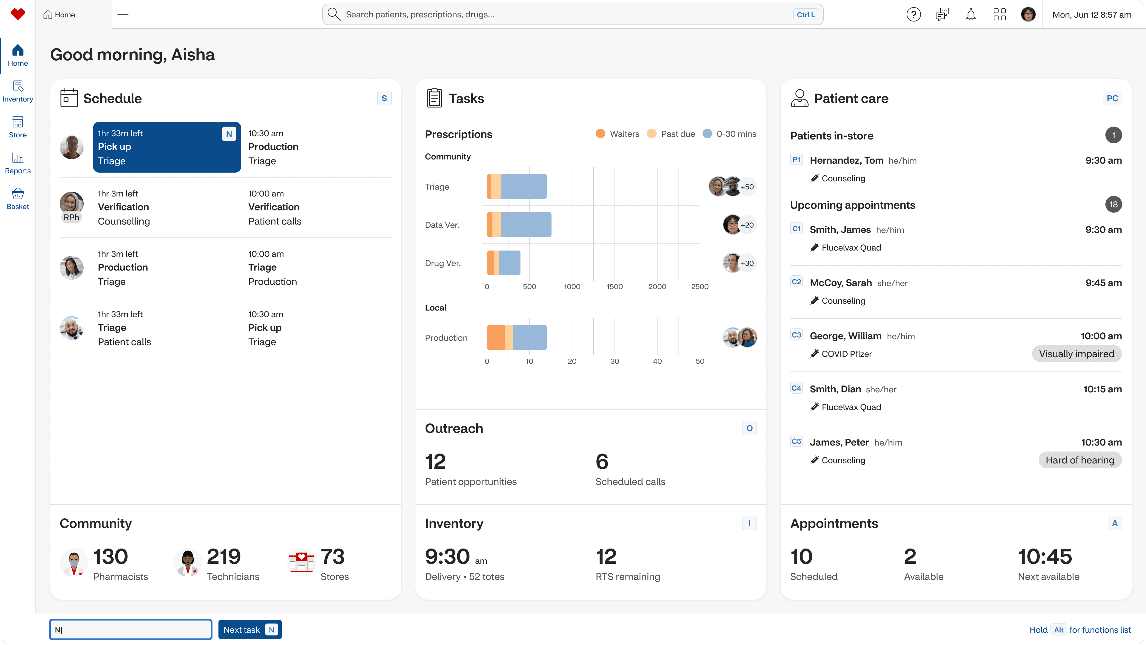
Centralised patient view
Patient360 keeps critical information visible across workflows, with contextual prompts for opportunities. We also enhanced the existing N-key system with a persistent function bar, improving keyboard navigation without disrupting long-time users’ habits.
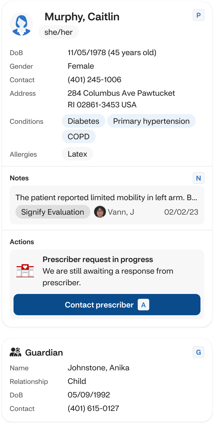
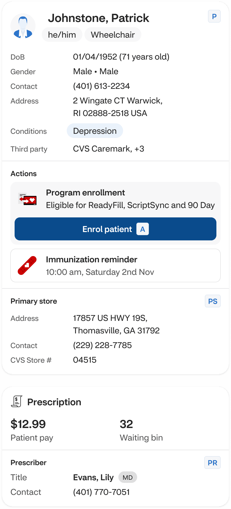
Patient360 sidebar
N-key function bar
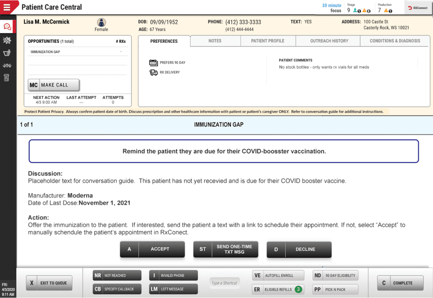
AI call modal
Proactive care, made easier
To improve patient outreach, I redesigned the Gap in Care flow, with an AI-guided call module providing real-time insights during colleague-patient interactions. Alongside this, I designed the Connect to Care task which makes it easy to identify and book eligible services, ensuring no opportunity for patient support gets missed.
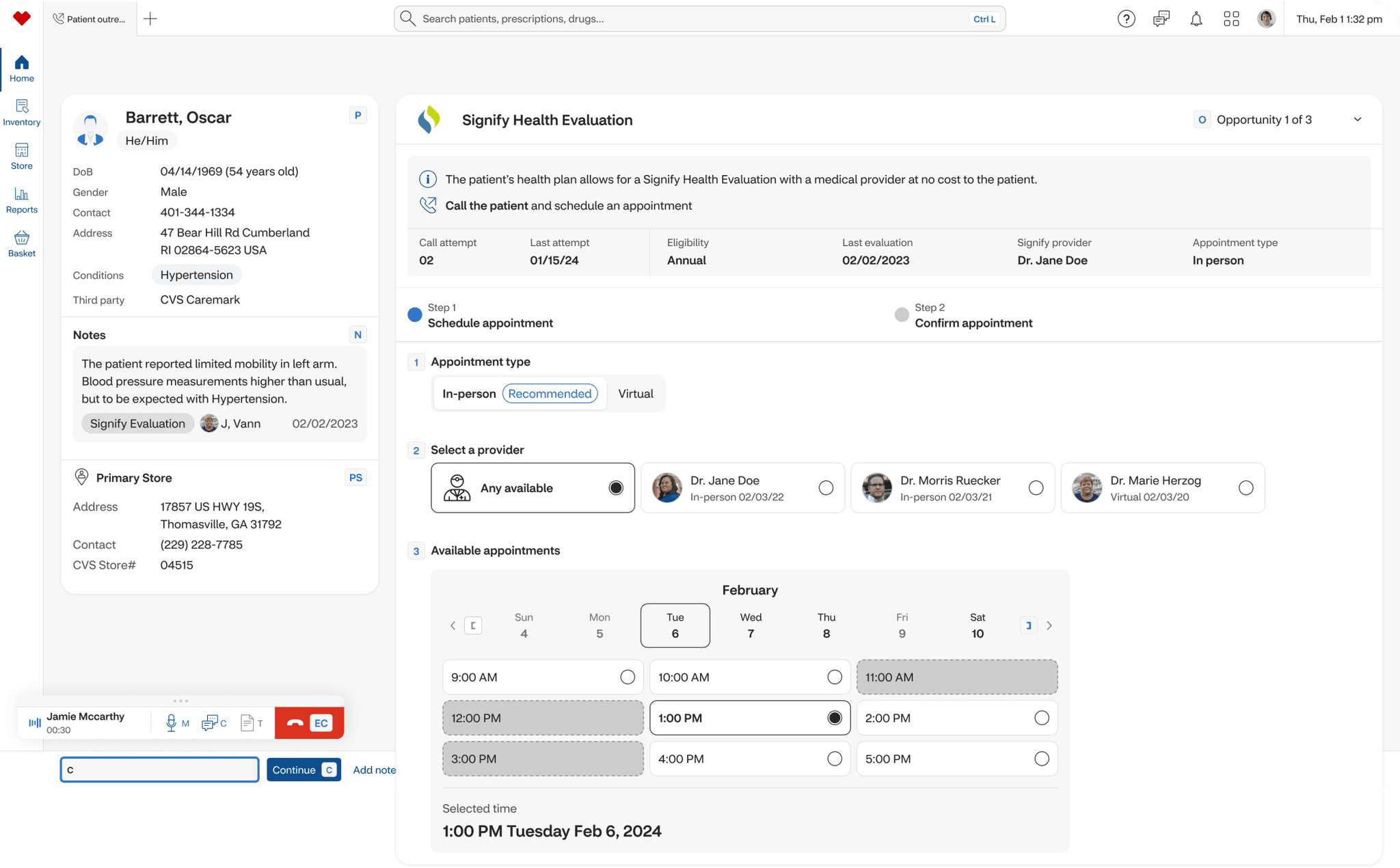
Connect to Care
Safer, smarter decisions
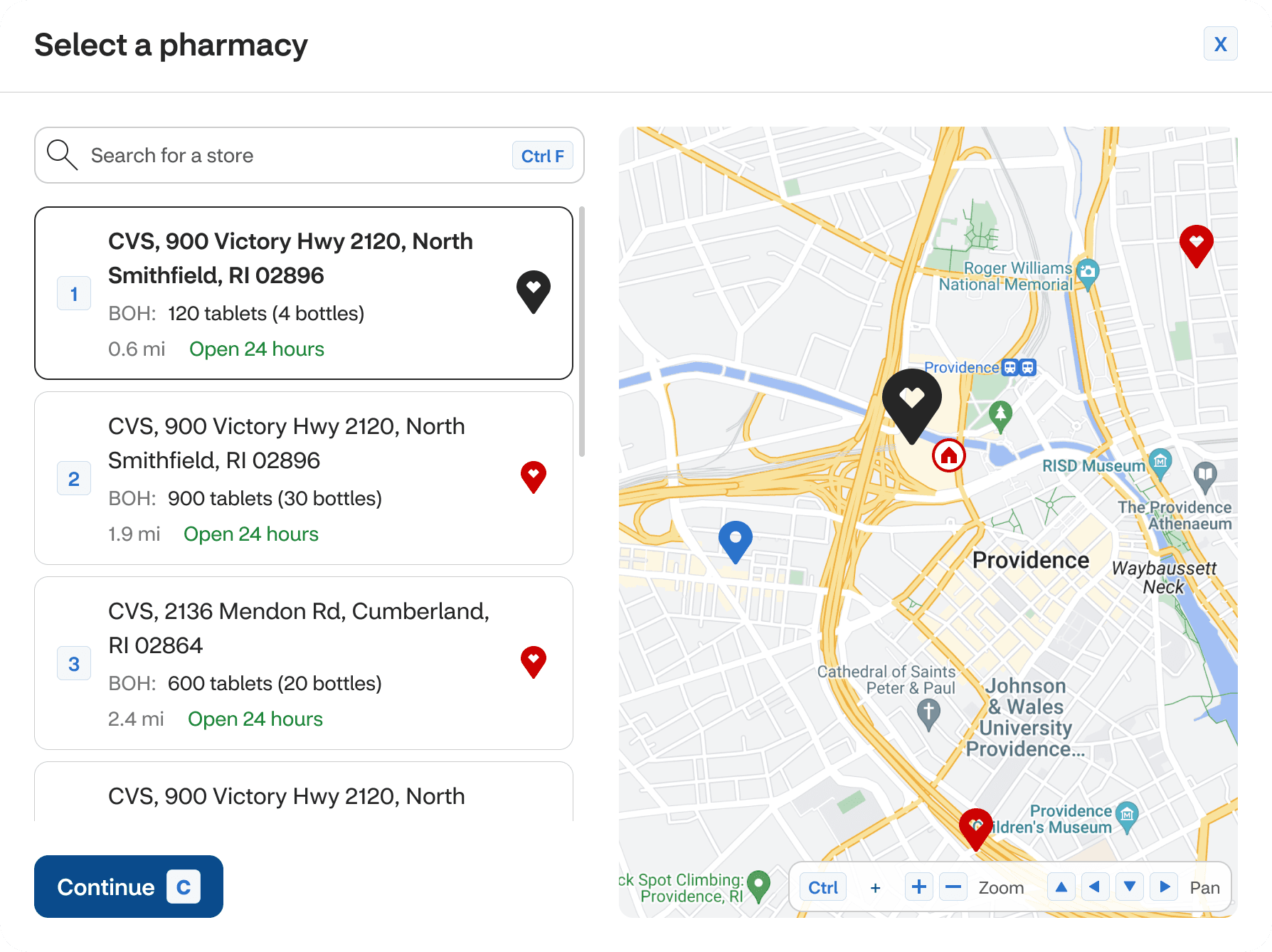
Recognising how errors impact both safety and efficiency, I designed proactive alerts, namely Delay in Therapy and the RPhAI (a pharmacist-facing AI alert system) to catch potential issues, like missing stock or anomalies in the prescription, before they become critical. Additionally, I created a new Program enrolment section to help colleagues align and simplify medication refills, clearly showing the benefits and savings to patients.
RPhAI
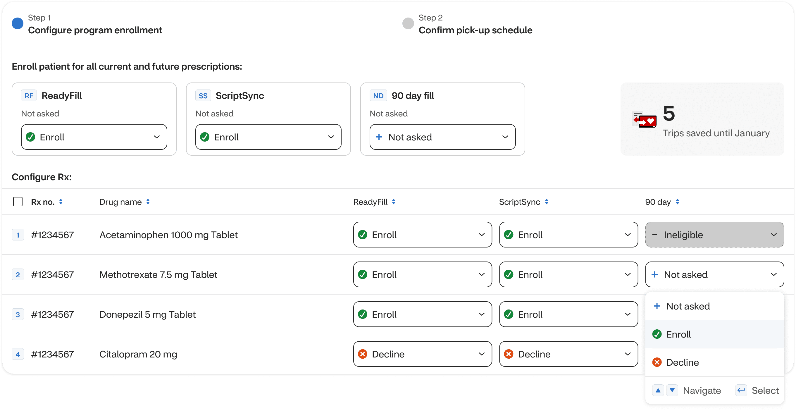
Program enrolment
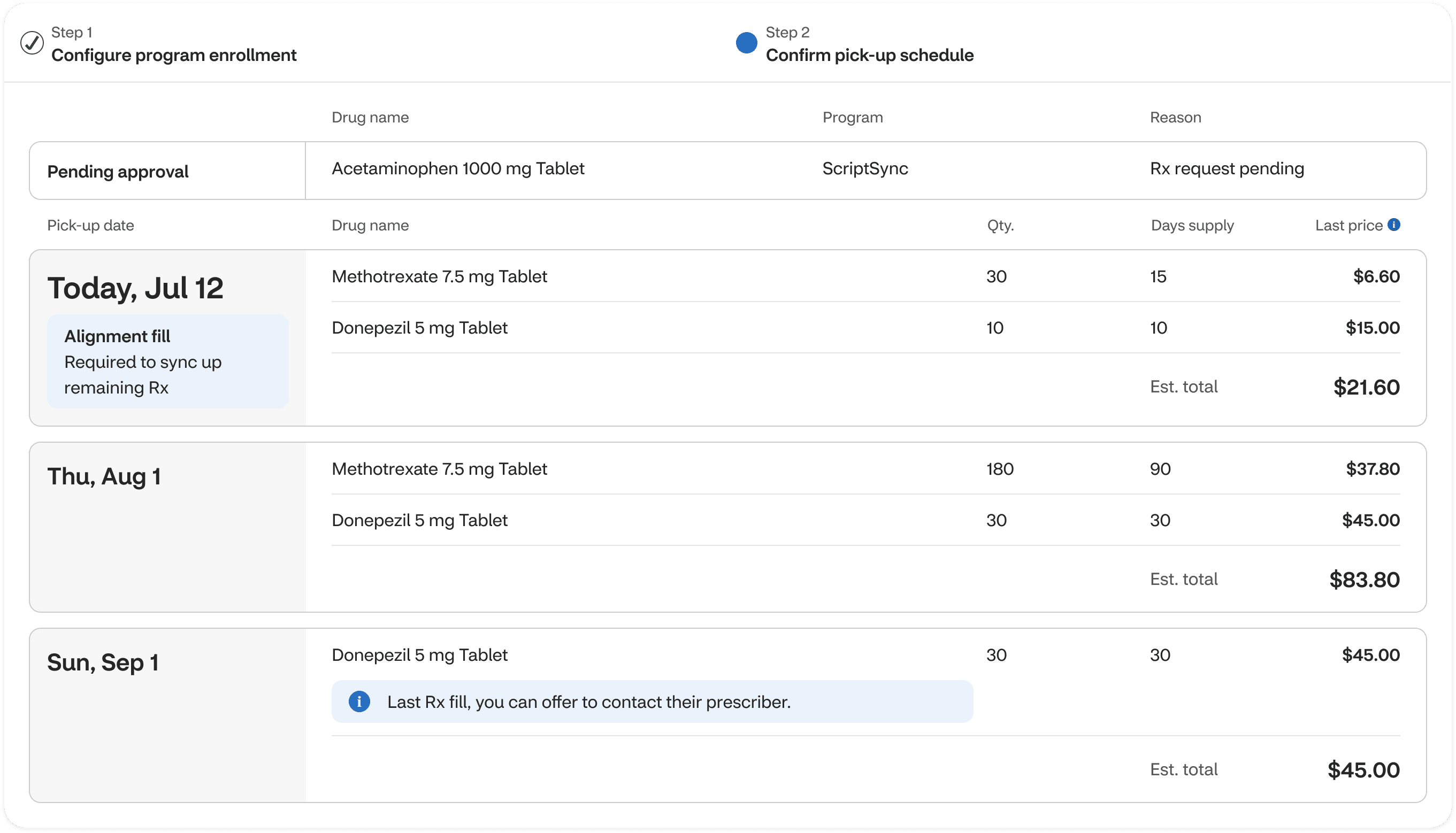
Program enrolment - Pick up baskets
Delay in Therapy store modal
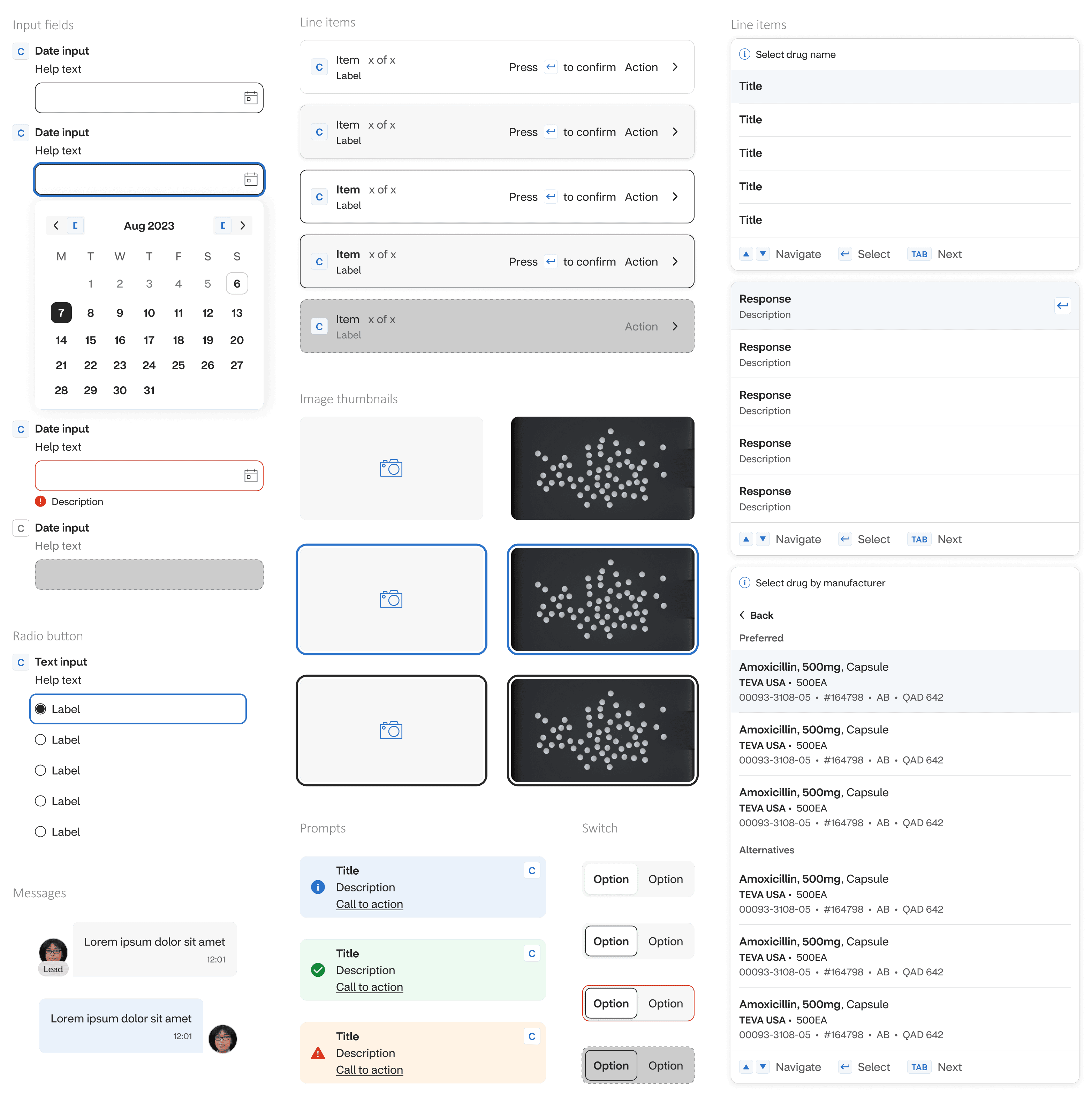
Design system / Experience language
Although not originally part of the brief, I recognised early on that our growing prototype required clear structure to stay coherent and scalable. To address this, I created an extension library for CVS’s existing design system, introducing modular components and standardised design tokens to support consistency across features.
By taking ownership of this extension, I helped the team streamline prototyping efforts, ensured alignment with CVS’s brand identity, and laid a robust foundation for the scalability of future design work beyond this project.
Results and Outcomes
This vision set a clear North Star for CVS’s pharmacy experience: a future where technology meaningfully supports colleagues and elevates patient care. My work helped drive tangible outcomes across the business:
Executive alignment
Earned buy-in from SVPs and the C-suite, shaping strategic priorities and investment for future projects.
Smarter workflows
Leveraged AI to simplify tasks and free up colleagues to focus on care, not admin.
New service opportunities
Proactive features reimagined how colleagues engage with patients, enabling and promoting better health outcomes.
Cultural shift
Helped reshape how colleagues perceive their work and CVS as a workplace, with tools that support them, not slow them down.
“This is moving the profession into a different world now. I am very positive, and hopeful and I'm loving it”
“This is completely different. I'm excited to see what CVS does in the future”
User testing