Reimagining the travel experience to feel more personal, intuitive, and wonderfully Virgin
Virgin Australia
Overview
Virgin Australia is a domestic-focused airline with bold, wonderful ambitions, but they’re stuck in reactive loops, solving small problems in isolation. Their digital roadmap runs through to 2027, but what comes next is undefined.
That’s where we came in: to craft a North Star vision that could inspire teams, align decision-makers, and push the brand forward.
Role
Product designer
Team
3 Designers, Design Director
Timeline
3 months 2025
Disciplines
Strategy, Research, UX, Interaction Design, AI integration, Concept Development
Strategic context
Virgin Australia’s ecosystem is evolving, new tech, new loyalty ambitions, a roadmap through 2027.
But for guests, most of that transformation feels invisible.
The current experience is transactional, generic, and inconsistent with the Virgin spirit.
This vision sprint set out to change that — building both the strategic foundation and emotional spark for a future that was smarter, more seamless, and unmistakably Virgin.
Tensions
Through interviews, audits, and alignment sessions, five core tensions emerged, each revealing a gap between ambition and reality, and pointing towards a design opportunity.
Commercial vs Customer
Opportunity
Design for the overlap — where business uplift meets real guest value, especially in bundles, upgrades, and loyalty.
“Offer & Order is a commercial revolution — but our guests won’t feel it unless we design for it.”
Human vs Digital
Opportunity
Bring back the Virgin warmth — through tone, visuals, and delightful interactions that feel alive.
“We’ve lost the charm. Guests don’t feel the Virgin difference anymore.”
Segments vs Journeys
Opportunity
Replace flat segmentation with journeys that reflect real contexts, emotions, and behaviours.
“We treat all guests the same — but they’re not.”
Data vs Value
Opportunity
Make data feel personal, helpful, and human.
“We have so much data, but we’re not using it... We’re reactive when we should be proactive.”
Momentum vs Meaning
Opportunity
Establish a North Star to guide delivery with intent. Moving the brand forward, not just shipping features.
“Everyone’s moving, but not always in the same direction.”
Research & Discovery
Our senior team kicked things off in-person in Brisbane, while the rest of us joined remotely, working closely with Virgin Australia’s core stakeholders.
Those first workshops were about more than logistics; they set the tone for the sprint. We left with:
A shared understanding of Virgin’s goals and where design could make the biggest impact.
Agreement on the ambition (and constraints) of the project.
The early trust we’d need to move fast and think boldly together.
To set our North Star on solid ground, we ran a two-part audit examining current state and competitive landscape to identify where VA can differentiate through design
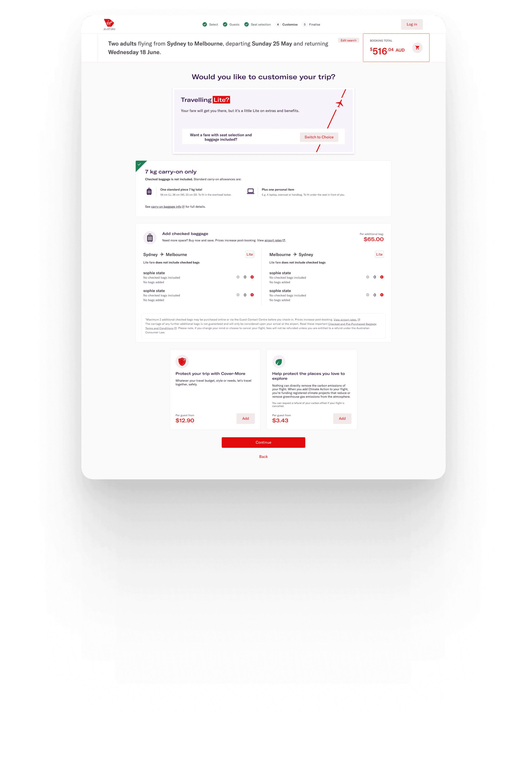
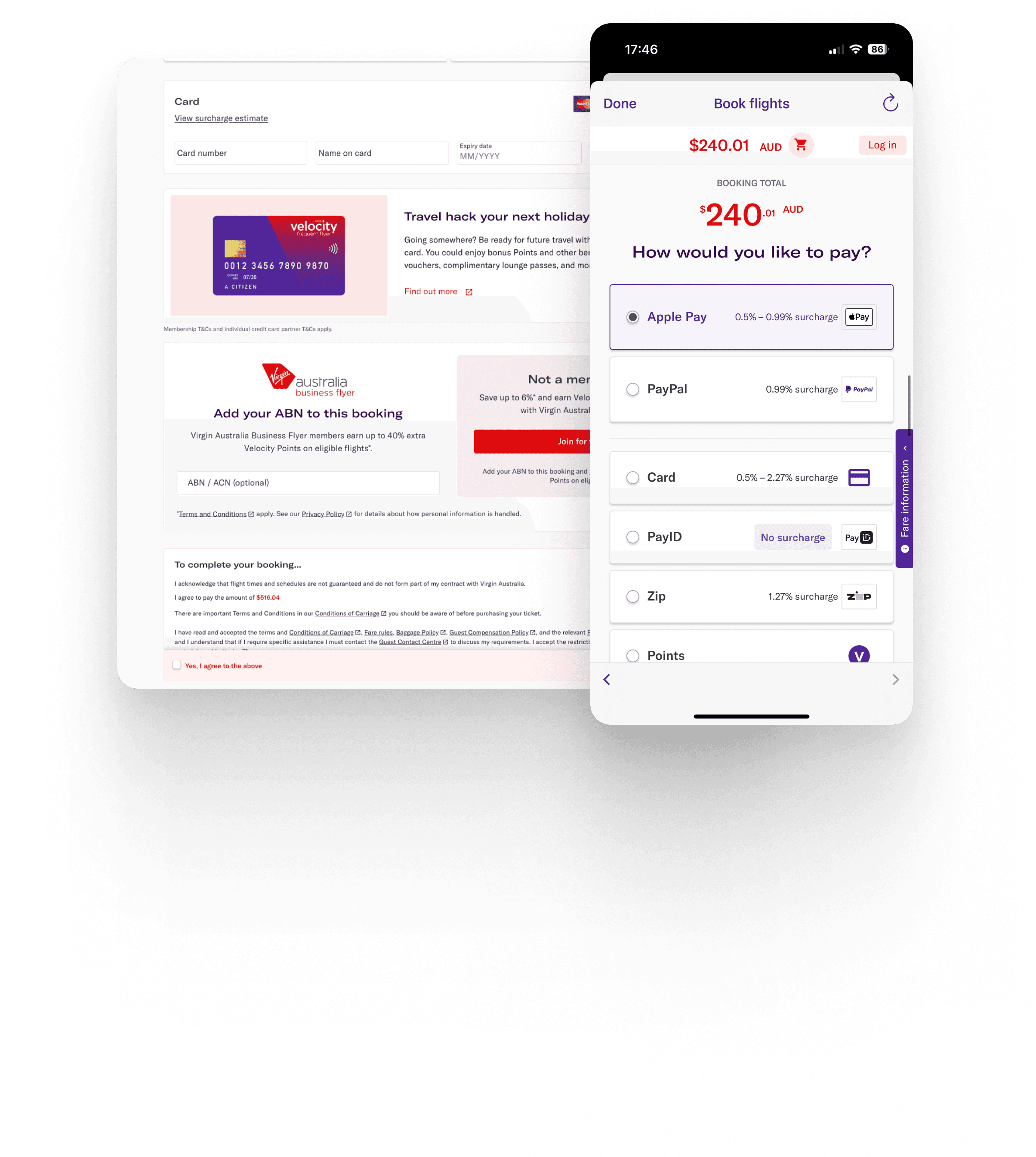
Smarter, Seamless Booking
Booking flows today are clunky and disconnected. By surfacing smarter bundles, and offering value-driven nudges, VA can make booking both easier and more Virgin.
Emotionally Engaging Loyalty Moments
Loyalty is often buried or disconnected from the journey. Virgin can make status, rewards, and upgrades feel joyful and alive, not transactional.


Standout experience language
Stand out from conservative competitors with expressive visuals and motion that capture the Virgin energy
Personalised Journeys, Not Generic Flows
Most experiences feel flat and one-size-fits-all. VA can lead by tailoring interactions based on guest type, context, and intent.
Limited Lifecycle Value
The app is underutilised outside of check-in and on the day features. There’s opportunity to expand the app value across planning, booking, during trip and after touchdown.
Defining the problem & strategic foundations
Mapping the Journey, Surfacing the Gaps
We translated our discovery into an end-to-end journey map — identifying where Virgin’s experience broke down and where it could shine.
Search & Discovery
Planning & Booking
Airport & In-Flight
During trip
Post trip
At each stage, we looked at both digital and physical touch points. Then we mapped moments of high friction, low emotional impact, and untapped opportunity, prioritising the ones where design could move the needle most.
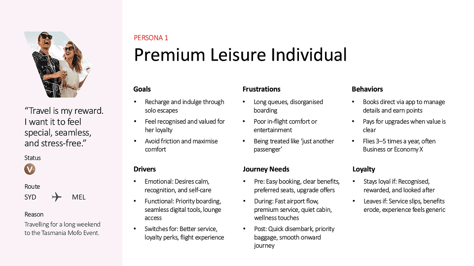
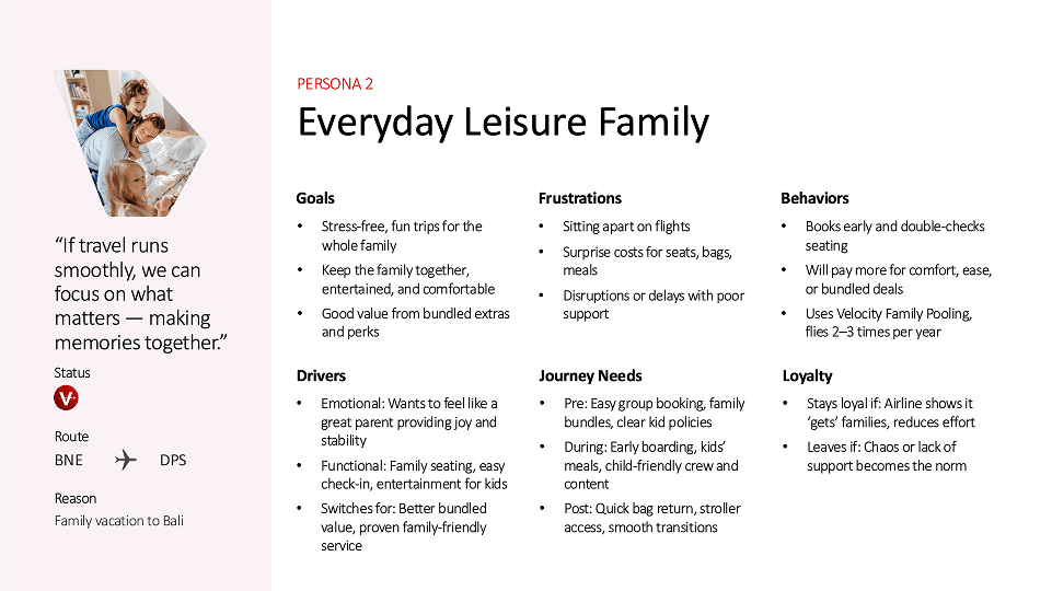
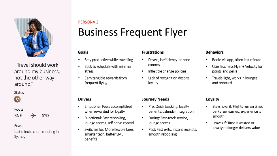
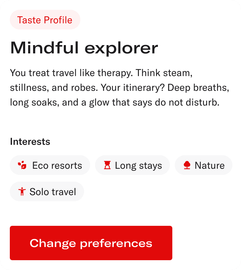
Three Personas, One Shared Problem: Disconnection
To anchor our ideas in real human needs, we created three key personas, each representing a segment Virgin serves today but doesn’t always design for intentionally.
Each persona had different needs, triggers, and thresholds for loyalty — but all shared a common thread: they wanted more than just efficiency. They wanted to feel recognised.
Leading with a unified brand
Virgin Australia had two sets of principles guiding its brand
Marketing principles vs Digital product principles
The result is a split personality. What the brand promised doesn’t always match what users experience. The principles themselves felt vague and overloaded, disconnected from the expectations especially in the digital landscape
We established our guiding principles:
Fresh, Wonderful, and Effortless
These principles form the foundation of our North Star vision, ensuring alignment between product and brand, and setting a clear benchmark for design excellence moving forward.
Fresh
Content is clear, concise, and compelling

Wonderful
Joyful moments that make people feel seen, valued and connected


Effortless
It just works, no learning curve, no second guessing


Ideation & concept development
With our journey maps and personas in place, we launched into ideation sessions and generating over 90 future-focused concepts designed to reimagine the Virgin Australia experience.
We explored opportunities across every stage of travel, from search and booking to in-flight and post-trip, and prioritised based on:
Impact on guests and business outcomes
Feasibility with Virgin’s tech stack (like SabreMosaic)
Fit with the North Star principles and user needs
These ideas weren’t just solutions they were strategic, modular, and ready to build toward. Each one was brought to life with lightweight mockups, fast, visual, and shareable, giving the team a quick way to get direction and feedback.

Leveraging AI to think faster, and more locally
Designing from London for an entirely Australian audience meant more than just working across time zones, it meant adjusting our work to a different cultural setting.
To close that gap, we leaned on AI not just for speed, but for empathy and as a local guide. I used it to explore everything from regional travel habits to the Aussie slang and tone. Helping us make sure the work sounded and felt recognisable and real.
It became a creative thought partner along the way: refining copy and uncovering edge cases I might’ve missed. It helped me move faster, but more importantly, it helped us move closer to the people we were designing for.
Systems thinking
Even though this was a vision sprint, I approached the work as part of a living system, not just a set of isolated screens.
I designed with data continuity in mind, ensuring information flowed from existing sources where possible and only asked from the user when necessary.
I planned for edge cases from day one especially for complex flows such as an individual booking just flights vs. a collaborative group booking for a complete trip through to splitting payments (flights, car rental, hotel, experiences and itinerary).
These scenarios shaped everything from content hierarchy to navigation logic on the trip detail page.
Every design choice was tested against business strategy and technical feasibility, ensuring concepts could plug into real systems and data structures.
For me and the team, vision work isn’t just about imagining the future, it’s also about making sure it can work in the real world.
Design DNA: Dialling It Up to 12
As part of the vision sprint, we launched a visual and motion exploration phase internally nicknamed “Dial It Up to 12”. The goal was to push beyond interface polish and define what would make the Virgin Australia experience feel ownable, emotional, and unmistakably Virgin.
Visual Treatments
We explored how Virgin’s existing assets (gradients, loyalty tiers, brand colours) could evolve into a more layered, expressive system:
Tier-based gradients for visual hierarchy without hard labels
Pattern overlays and ambient textures for a sense of depth and calm
Soft-glow accents to create moments of lightness and luxury

Motion as emotion
While I wasn’t directly involved in execution, I collaborated closely with our motion designer to shape motion concepts that would:
Reinforce the idea of “Moves Wonderfully”
Soften transitions
Celebrate key loyalty and upgrade moments with surprise and charm
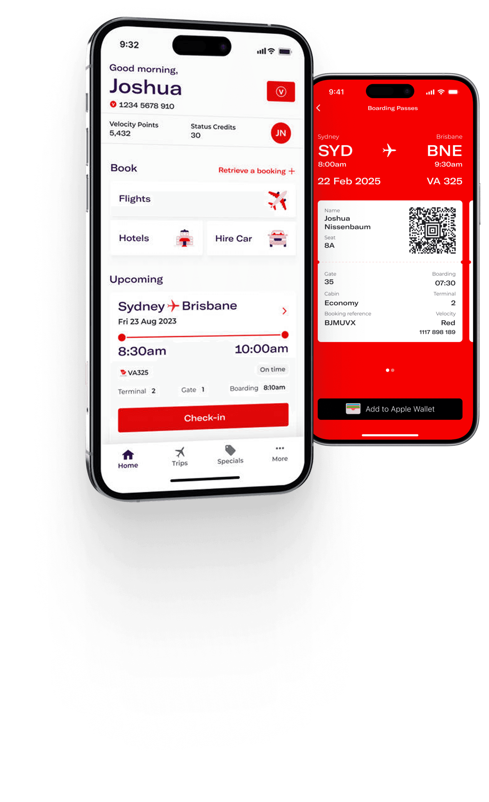
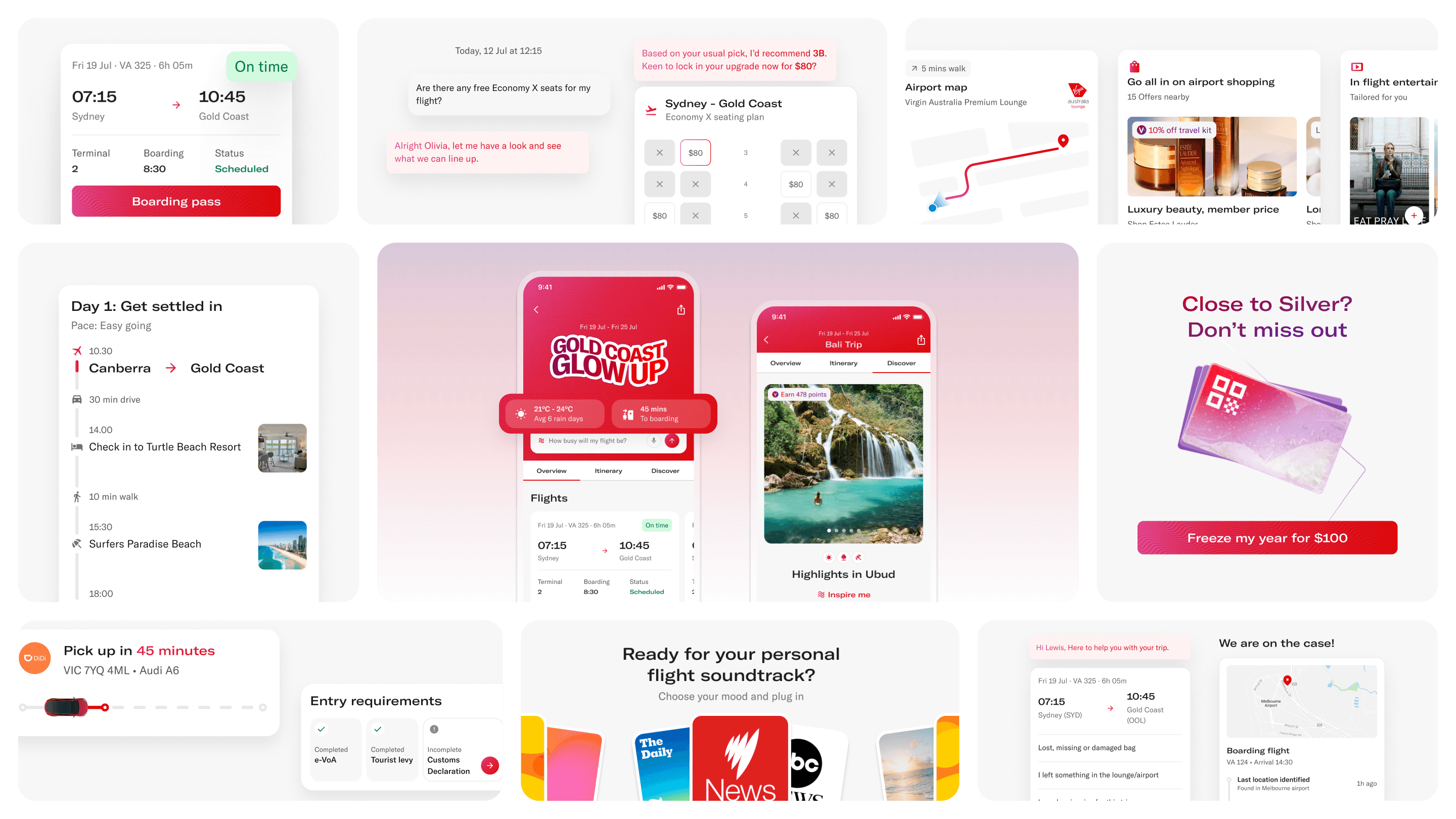
Solutions and features

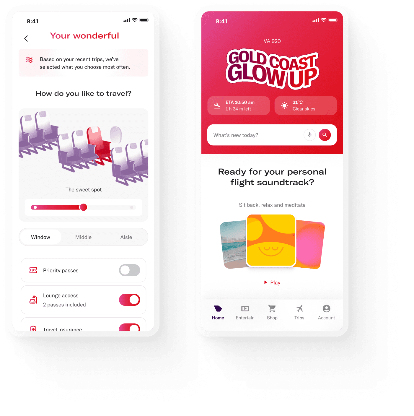

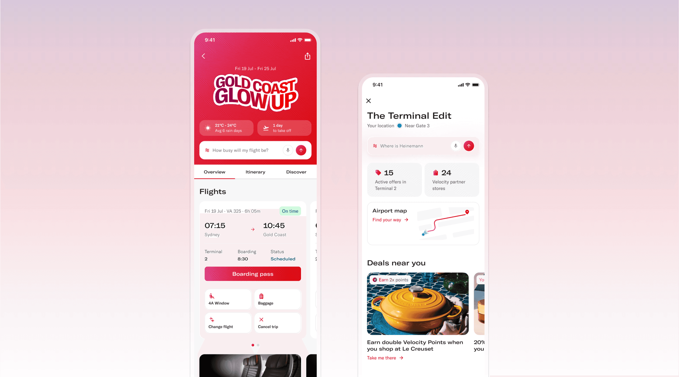
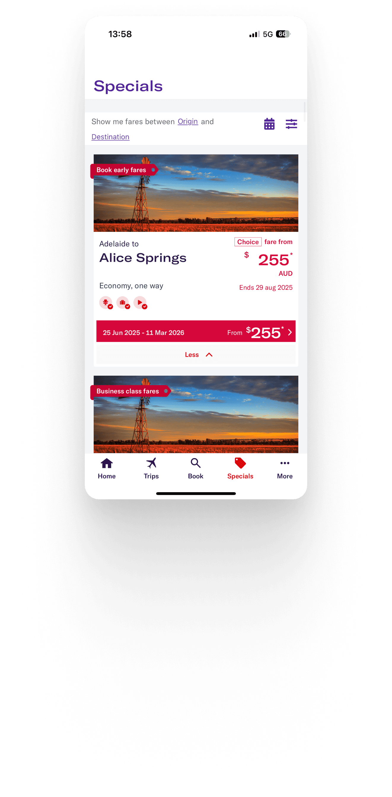
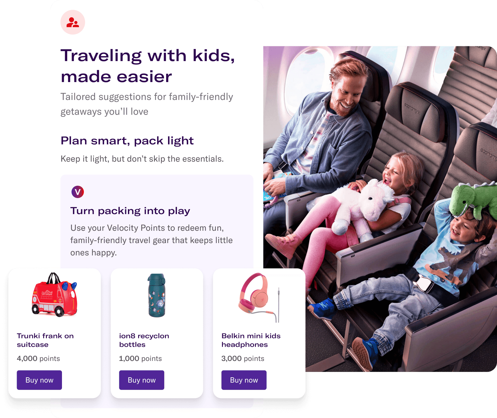
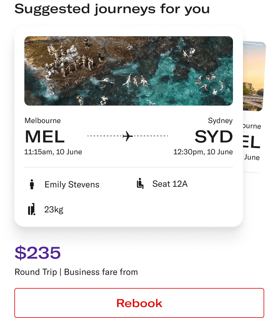
Discover your travel
Anticipating needs before they’re voiced and make it yours
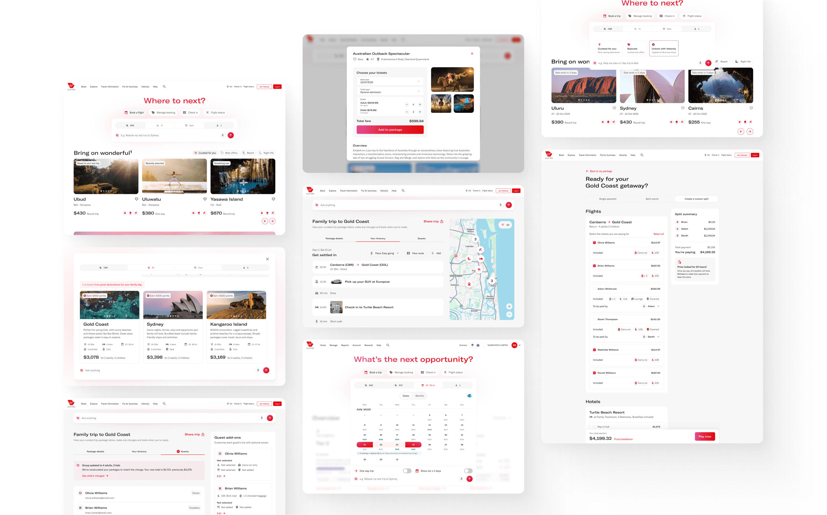
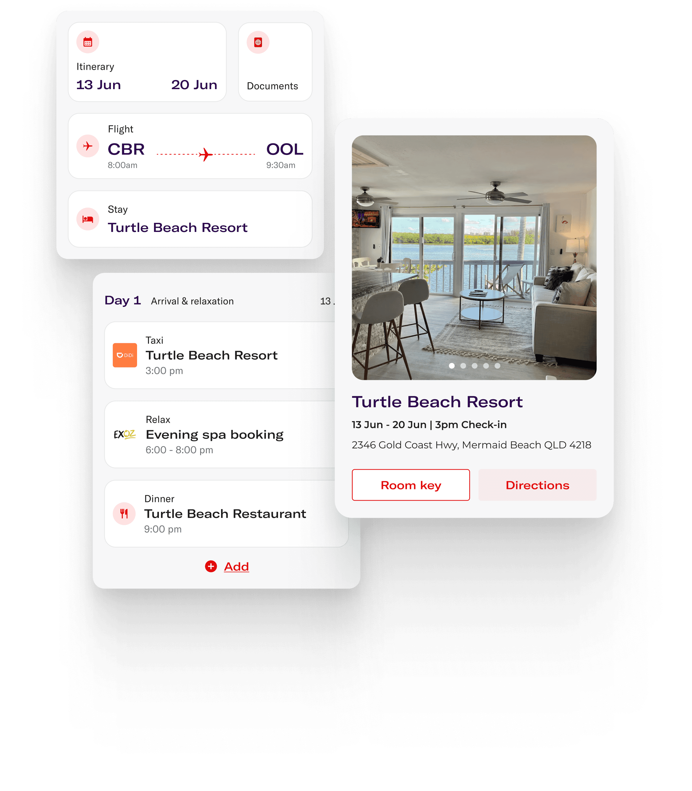
Frictionless Planning
Shape or share your trip, your way
Stay in control
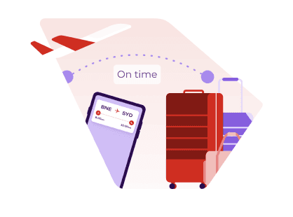
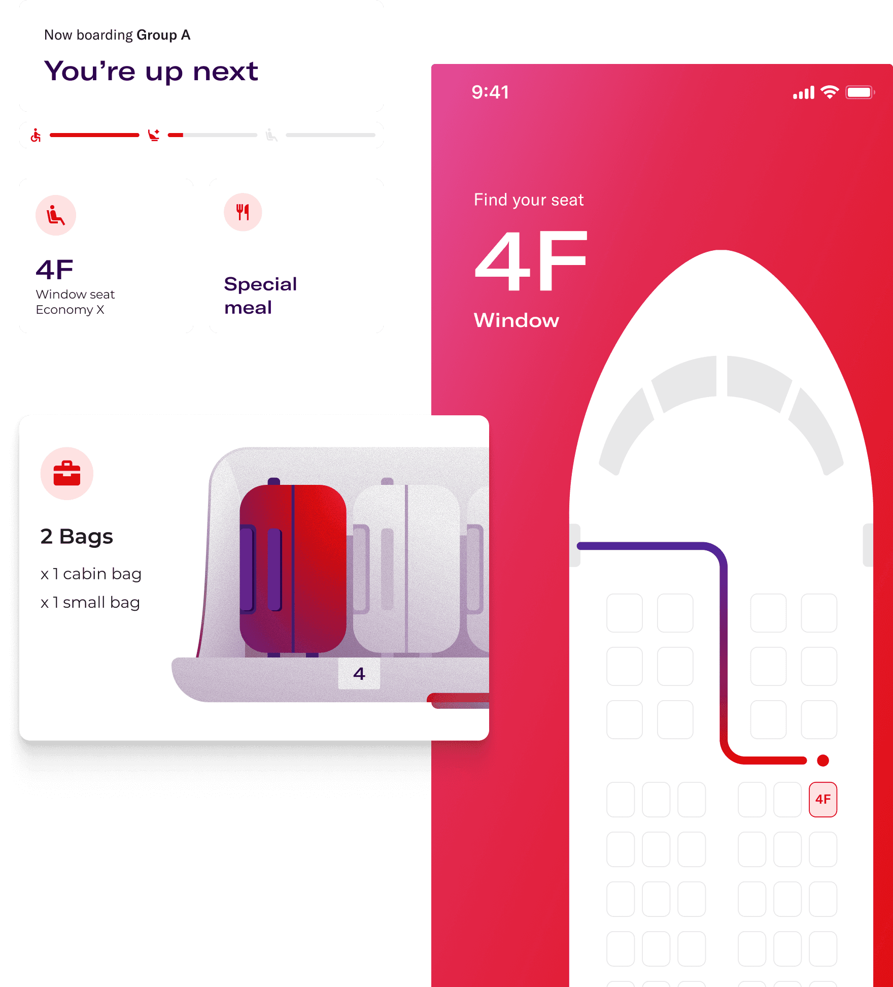
From check-in to touchdown, feel calm, in control, and cared for
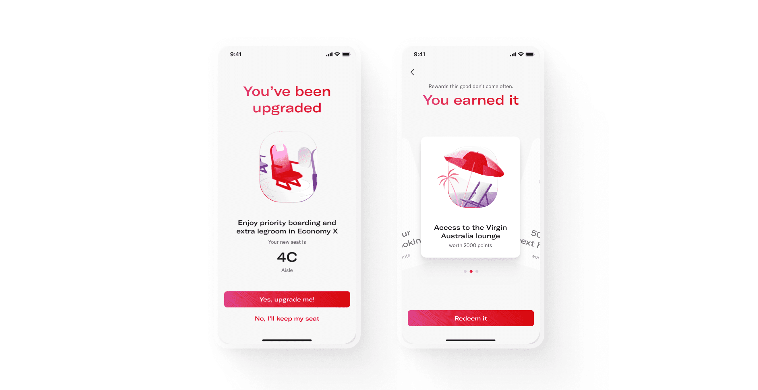
Loyalty, Recognition & Delight
Turning functional moments into moments of joy
Constraints & Reflections
This was a fast-moving vision sprint and while timelines were tight, the real challenge was limited access to key stakeholders. One of our main decision-makers was unexpectedly away for much of the project, which meant feedback was light and direction often unclear. That freedom came with trade-offs: we could push bold ideas without heavy constraints, but we lacked the steady signal that tells you you’re on the right track.
Still, the team stayed aligned and energised, using informal feedback loops with Virgin’s digital and strategy leads to guide decisions on feasibility, tone, and ambition.
If we’d had more time, I’d have loved to test concepts directly with airport staff and travellers. That would have deepened our understanding and helped fine-tune the vision to work across every touchpoint, not just in presentations.
In the end this was about alignment, not refinement, and creating a vision Virgin Aurstralia could grow into, not just sign off.